From a category in your head to a scored comparison matrix
Describe what you're comparing, approve the metrics that matter, populate them from real sources with every value cited, and read the result as a sortable matrix, charts, and a single score. This page walks the whole path with live screenshots.
Everything lives in a workspace
A workspace is one comparison: its vocabulary, its metric columns, its items (the rows), its sources, and its scoring rules. The public examples are readable by everyone; every workspace you create is private to you. Three ideas do most of the work: schema before data (you approve what gets measured before anything is fetched), source-aware values (every number carries where it came from, a confidence level, and a verified date), and review-gated AI (AI proposes values with citations; a human approves them).
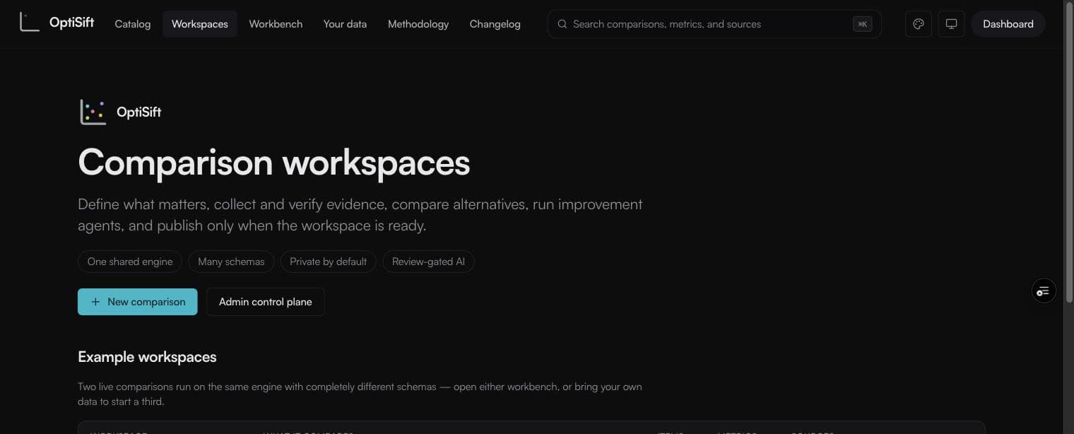
Create from a recipe or your own decision
- Sign in, then open Workspaces → New comparison.
- Choose an evidence recipe for SSDs, MacBooks, iPhone upgrades, or consumer-technology adoption—or press Start blank. A recipe fills the decision contract but never locks it.
- If you use a recipe, choose a decision lens such as Developer, Camera, or Rural. The lens states what “best” means and adds those priorities to the evidence brief.
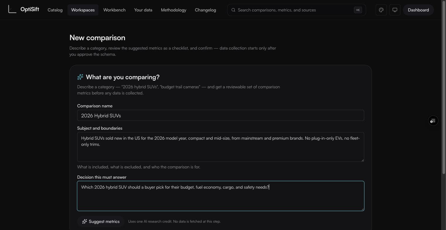
- Describe the category: a name, the subject and boundaries (what's in, what's out), and the decision it must answer. Concrete boundaries produce sharper metrics.
- Press Build evidence plan — one AI research credit. SiftGuide returns an editable schema plus attributed source leads; it does not publish or approve data for you.
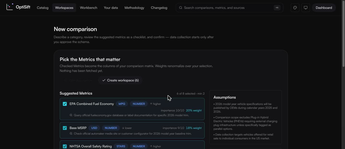
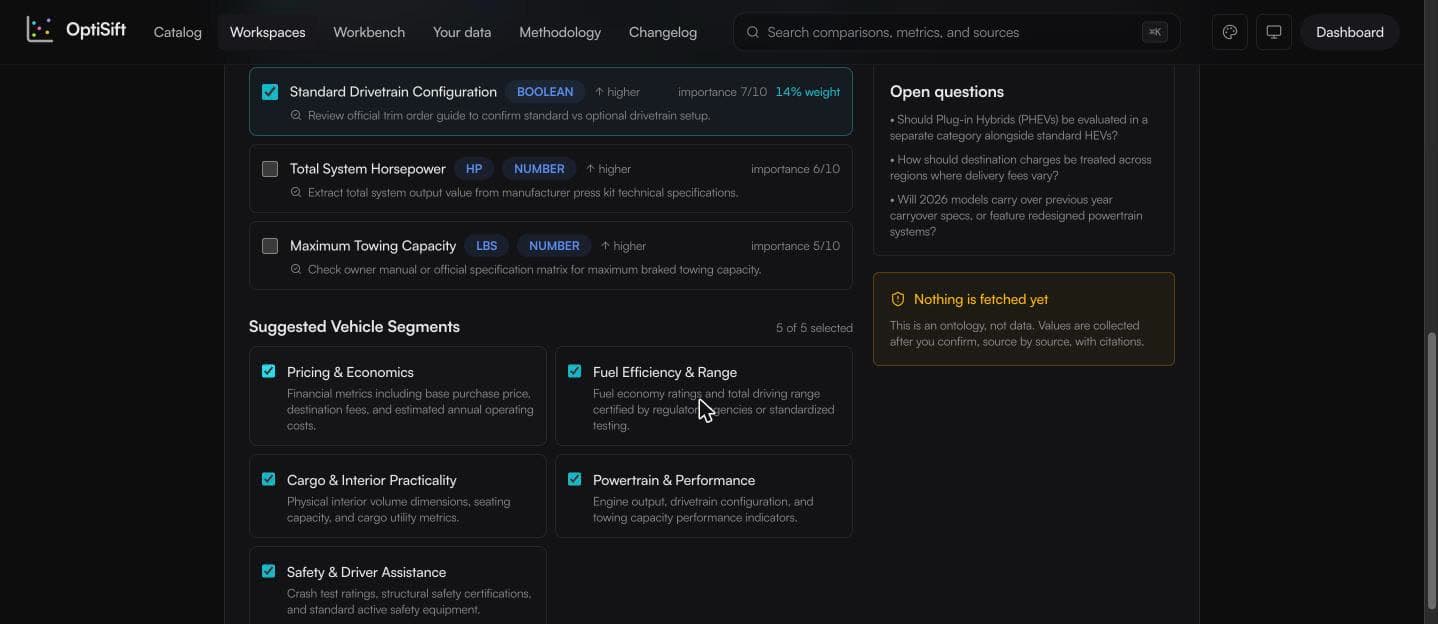
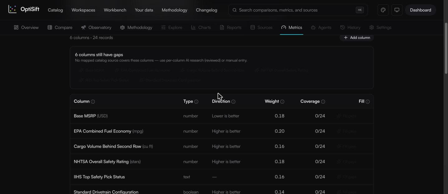
- Review the checklist: each metric shows unit, type, direction, importance, the weight it would carry, and how a value should be verified. Weights renormalize live over your selection.
- Press Create workspace. Only now does anything persist — a private workspace with your columns and zero rows.
Populate the matrix
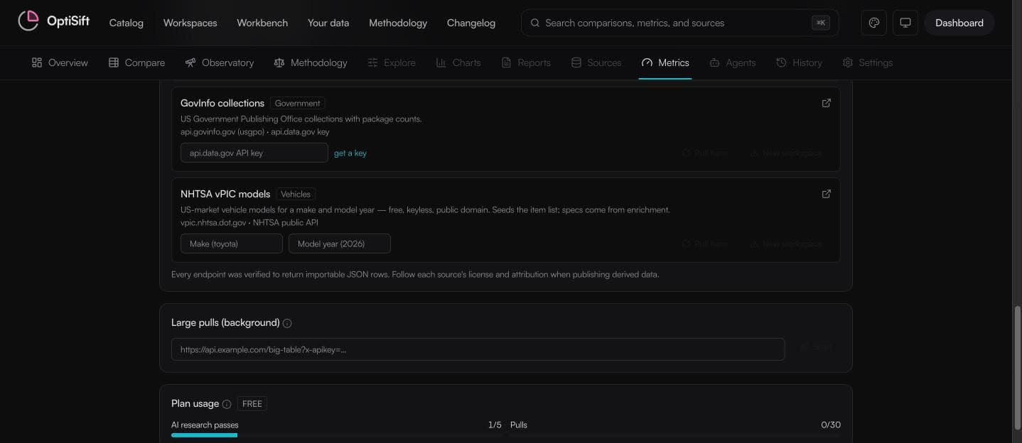
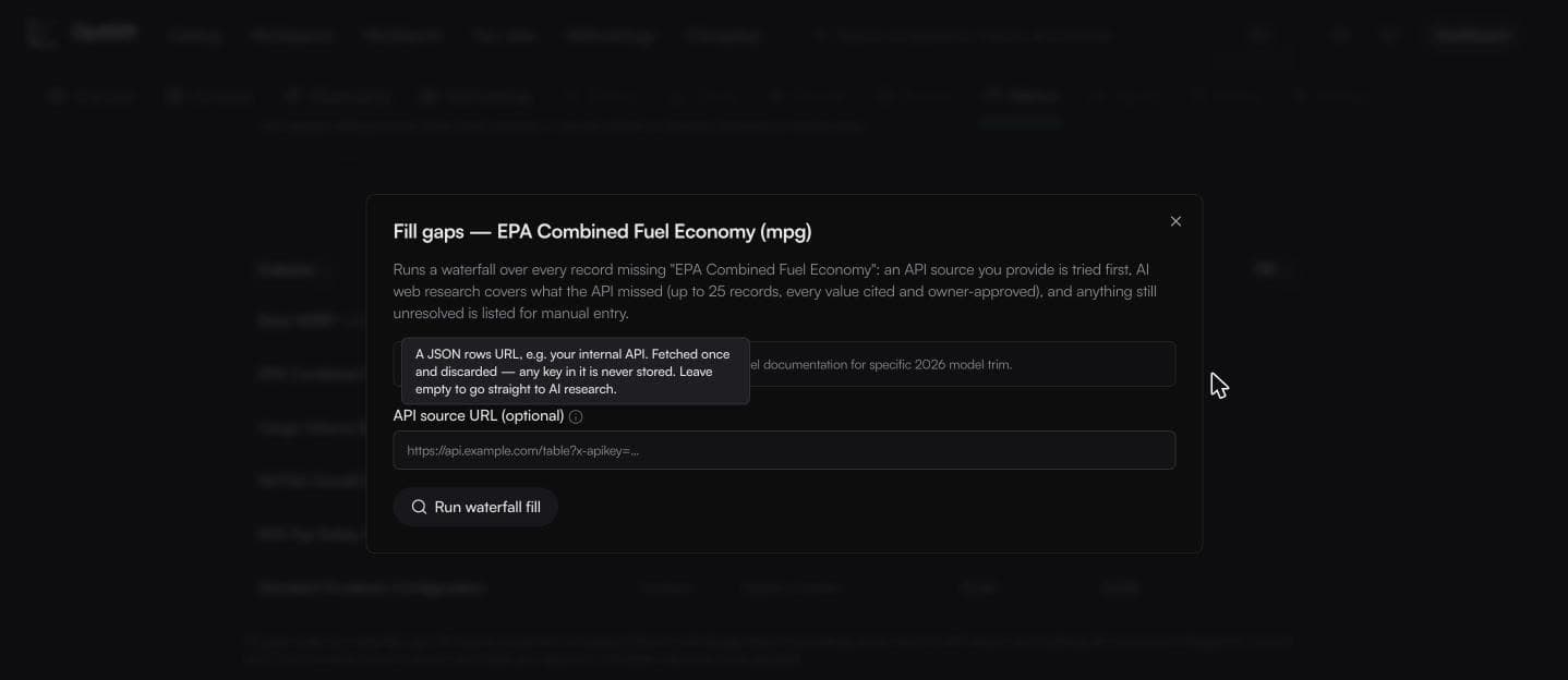
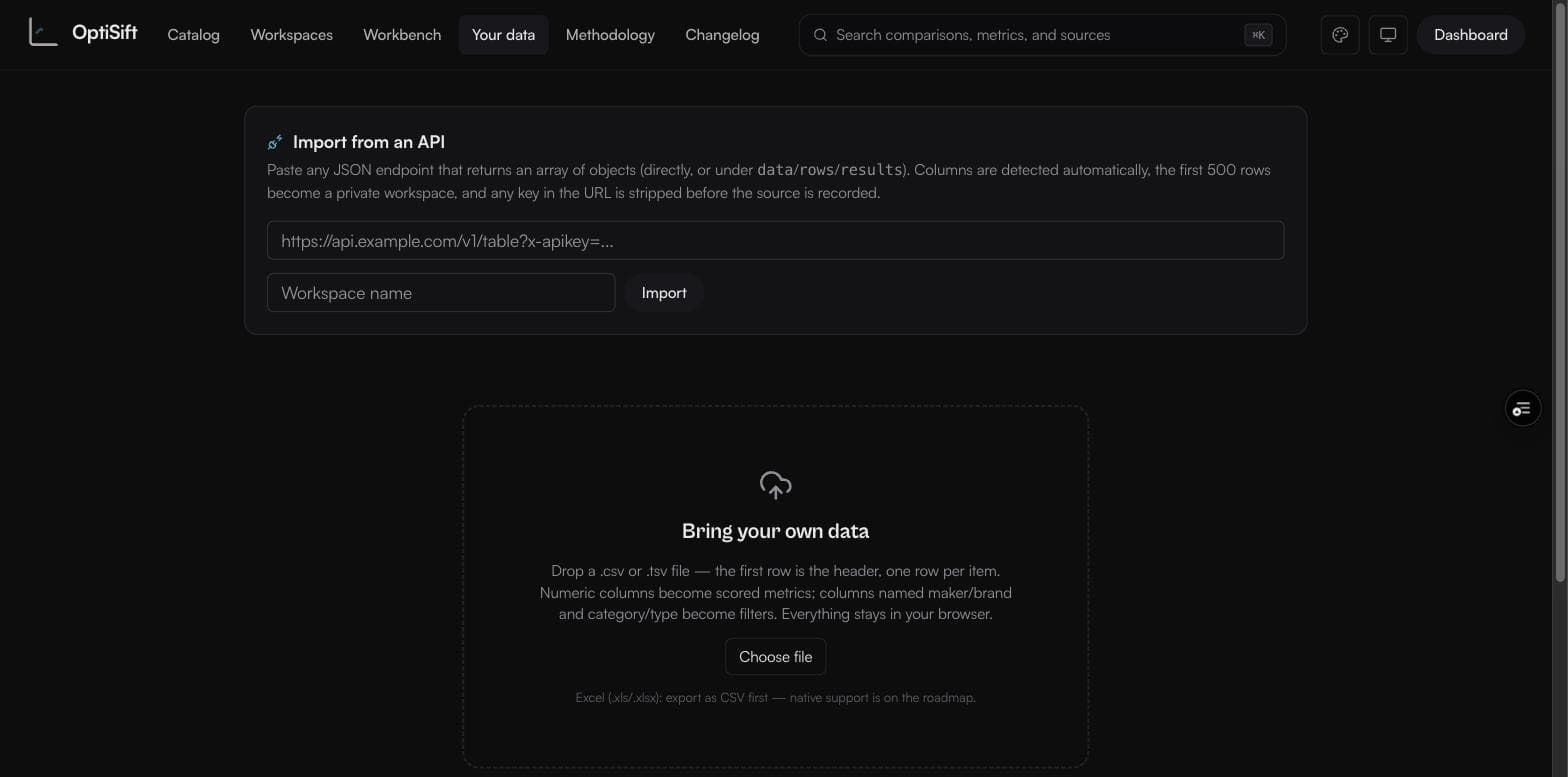
A new workspace lands on its Metrics tab: columns exist, coverage is zero. Population is two moves — get items in, then fill each column's values. Items come from the connector catalog (connectors marked mapped declare exactly which fields they import), from any JSON API URL, or from a CSV. Values fill through a waterfall: your API source first, then AI web research over the gaps (every value cited, and applied only after you approve it), then manual entry for whatever remains.
Read and work the matrix
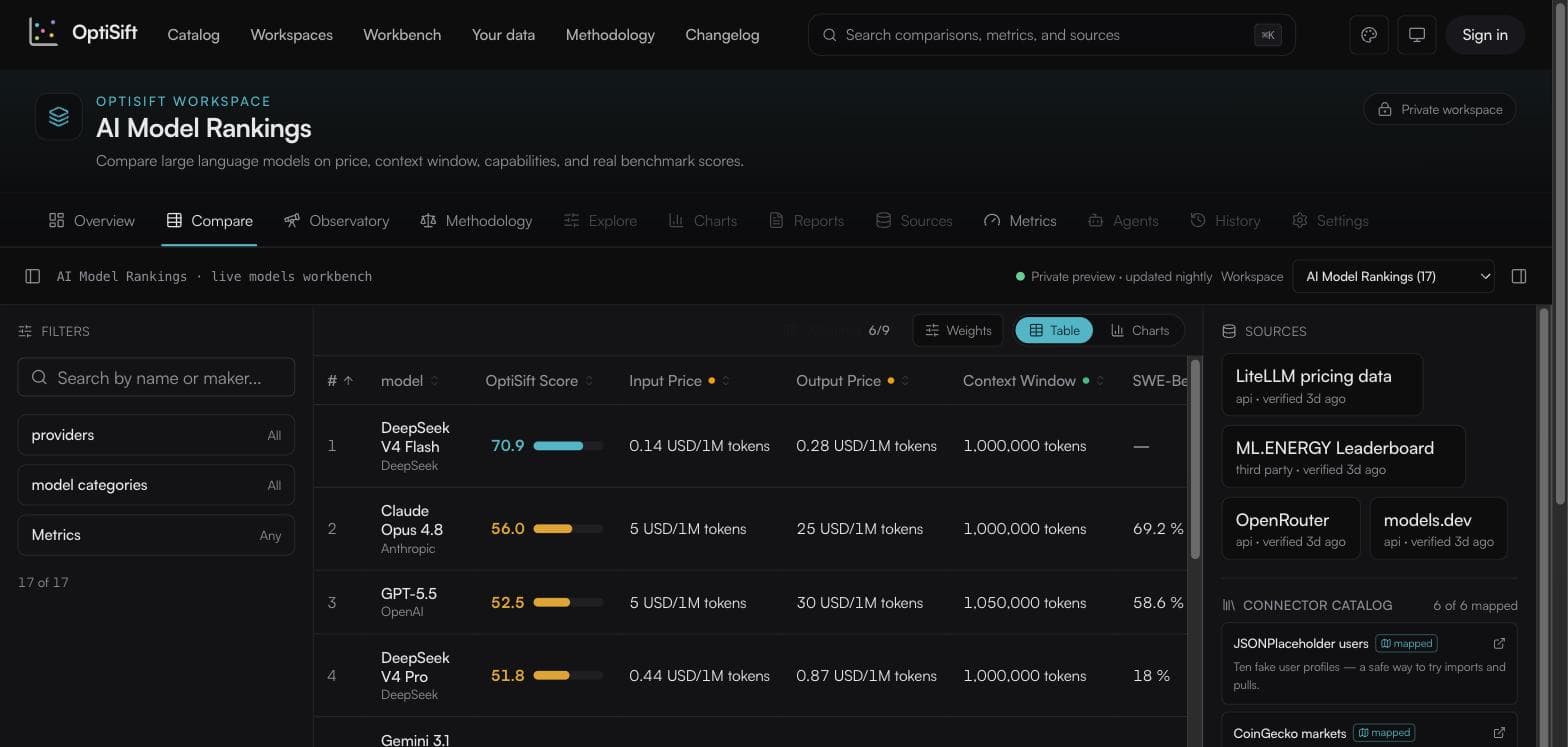
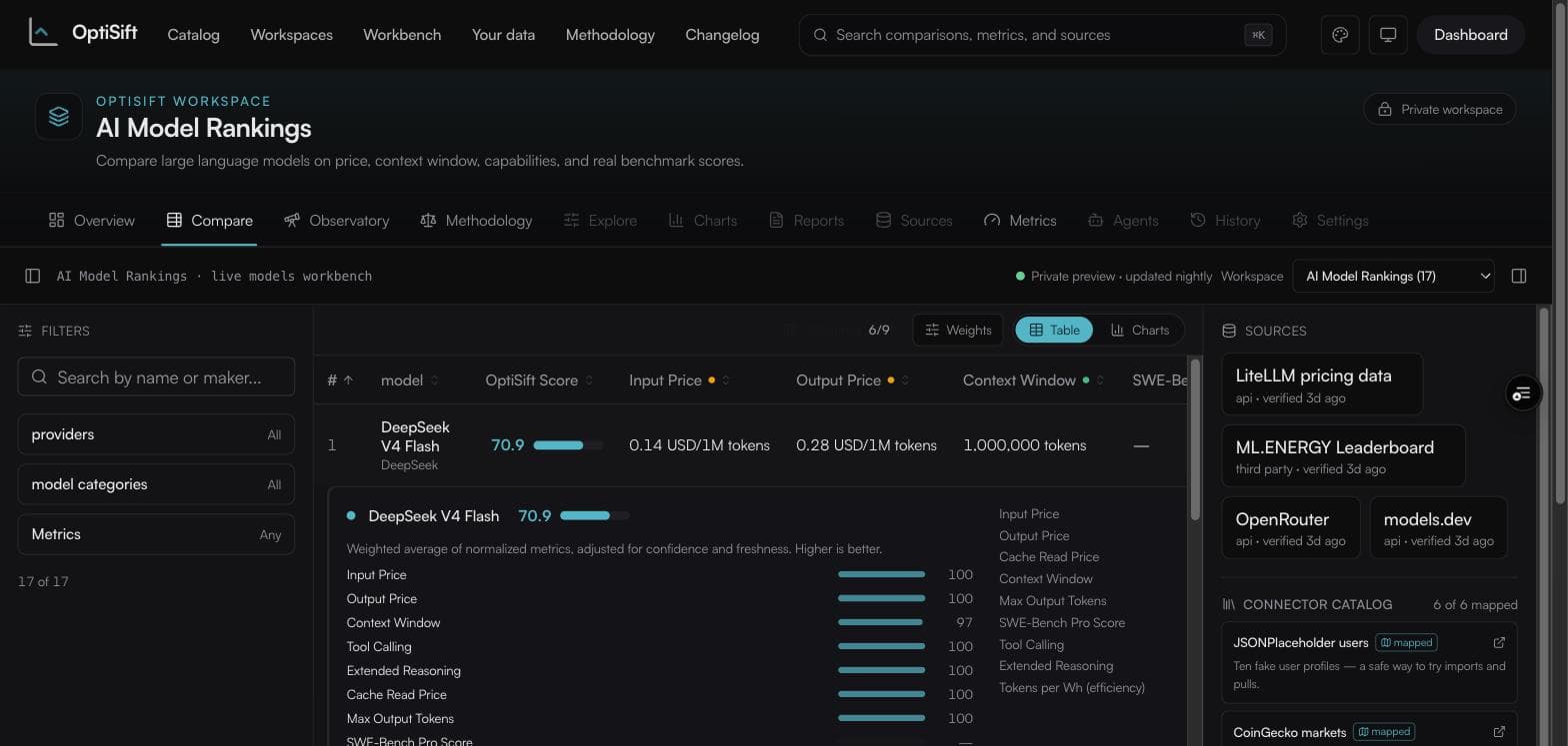
- · Coverage dots in each metric header: green = every visible row has a value, amber = partial, red = none. Hover for the exact count.
- · Click any row to expand it: the score's composition plus every metric value — the same data as the cells, by construction.
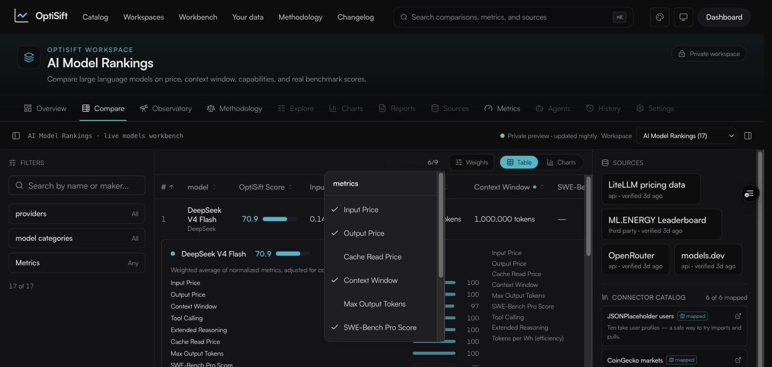
- · Columns picks which metrics show; sorting a hidden metric un-hides it automatically.
- · Weights runs what-if scoring privately — ranks reorder for you alone.
- · Everything — search, filters, sort, columns, weights — lives in the URL. Copy the address bar to share your exact view.
Charts pick themselves
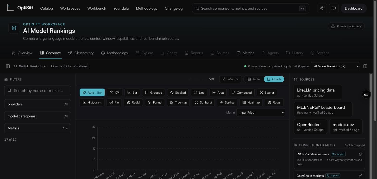
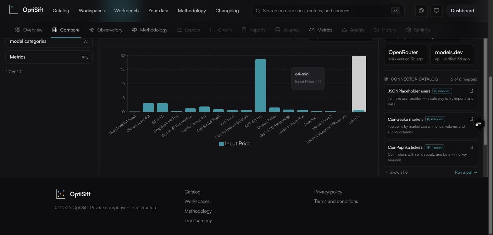
The chart view opens in Auto: the chart type follows the selected metric's own type. A number across items is a bar — item names aren't an ordered axis, so Auto never draws a line over them — and a yes/no or text metric becomes a count bar. Sixteen manual chart types remain one click away.
Bring a CSV or any JSON API
Your data takes a .csv/.tsv file — parsed entirely in your browser, numeric columns become scored metrics, nothing uploads until you save it as a private workspace — or a JSON API URL, importing the first 500 rows with any embedded key stripped before the source is recorded.
What the score means
Each item's score is a weighted average of its metrics, normalized 0–100 against the current cohort and adjusted for data confidence and freshness. Teal ≥ 70, amber ≥ 40, rose below — bands within this cohort, not an external standard. Two cell states matter: — means never fetched; n/a means the source was checked and had nothing. The full math, a live reproduce-any-score widget, and an honest limitations section live on the methodology page.
Questions, answered straight
QDo I need an invitation to get my own account?
Yes — public signup is off; accounts are created by invitation.
QWhat are the usage limits?
On the free plan: 5 AI research passes and 30 URL pulls per rolling 30 days. The wizard's Suggest metrics costs one pass; each Fill-gaps AI stage costs one more. The plan meter on the Metrics tab shows where you stand.
QCan the AI publish values on its own?
No. AI research returns proposals with a source URL, a supporting quote, and a confidence grade; you tick the rows you accept. A value the AI can't find stays not found — never estimated.
QWho can see my workspace?
Only you. Workspaces you create are private to your account. The public examples are readable by everyone but writable only through their review pipeline.
QA pull created columns I didn't ask for. Why?
Mapped catalog connectors import only their declared fields. An arbitrary URL mirrors whatever fields its rows carry — but every auto-created column starts at weight 0, so it can't affect any score until you promote it.
QIs the API key in my pull URL stored?
No — fetched once and discarded; the recorded source drops the query string. Scheduled pulls store the URL encrypted because they must re-run without you present.
QWhy did Auto give me a bar chart instead of a line?
A line implies an ordered axis; item names aren't one. The manual Line button still exists — Auto just won't lie for you.
QCan I share exactly what I'm looking at?
Yes — copy the URL. Search, filters, sort, visible columns, and what-if weights are all encoded in it.
QMy spreadsheet is .xlsx. Can I upload it?
Export as CSV first (File → Save As → CSV). Native .xlsx is on the roadmap; CSV and TSV parse entirely in your browser today.
QHow do I turn the floating help button off (or back on)?
Open it and choose Hide help. It stays off on this browser until you turn it back on from the footer's "Show help button" link.